How to design your first App Store screenshot
Build a first screenshot around one clear promise, a readable product view, and a story the following slides can prove.
Before you start
- Lead with one promise that the product view can support.
- Make the first three screenshots do different jobs.
- Use small-size reviews and a clear testing question to guide revisions.
The first screenshot has a simple job: help someone understand what the app will do for them. It does not need to explain every feature, display every screen, or fit the entire brand story into one image. Start with a single useful promise, then choose the product view that makes that promise believable.
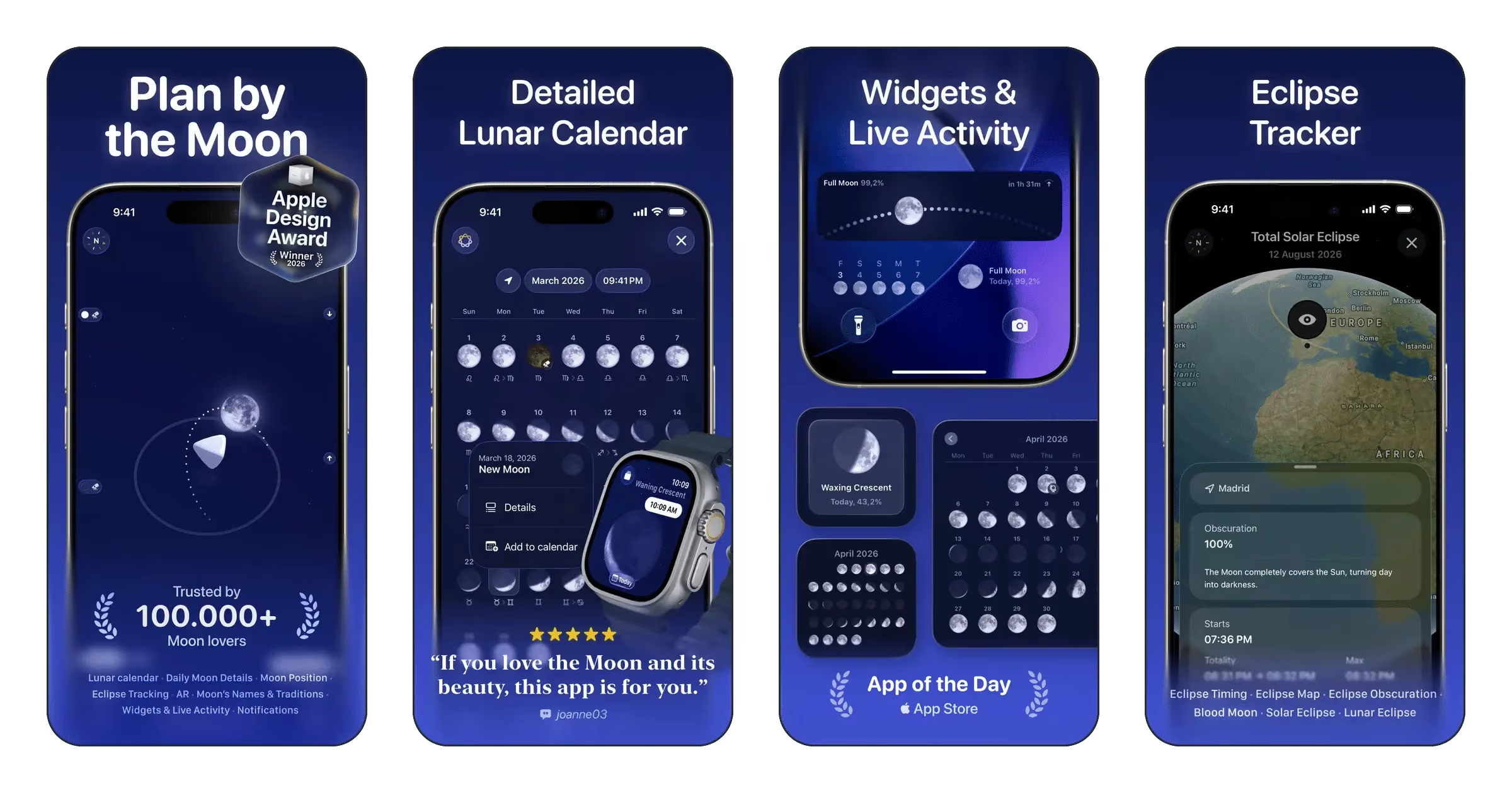
Apple notes that, when no app preview is available, the first one to three screenshots can appear in search results depending on orientation. It recommends using captured app UI and giving subsequent screenshots a main feature or benefit. That makes the opening of the sequence worth planning as a unit. See Apple’s product page guidance for the official context.
Write the promise before choosing a frame
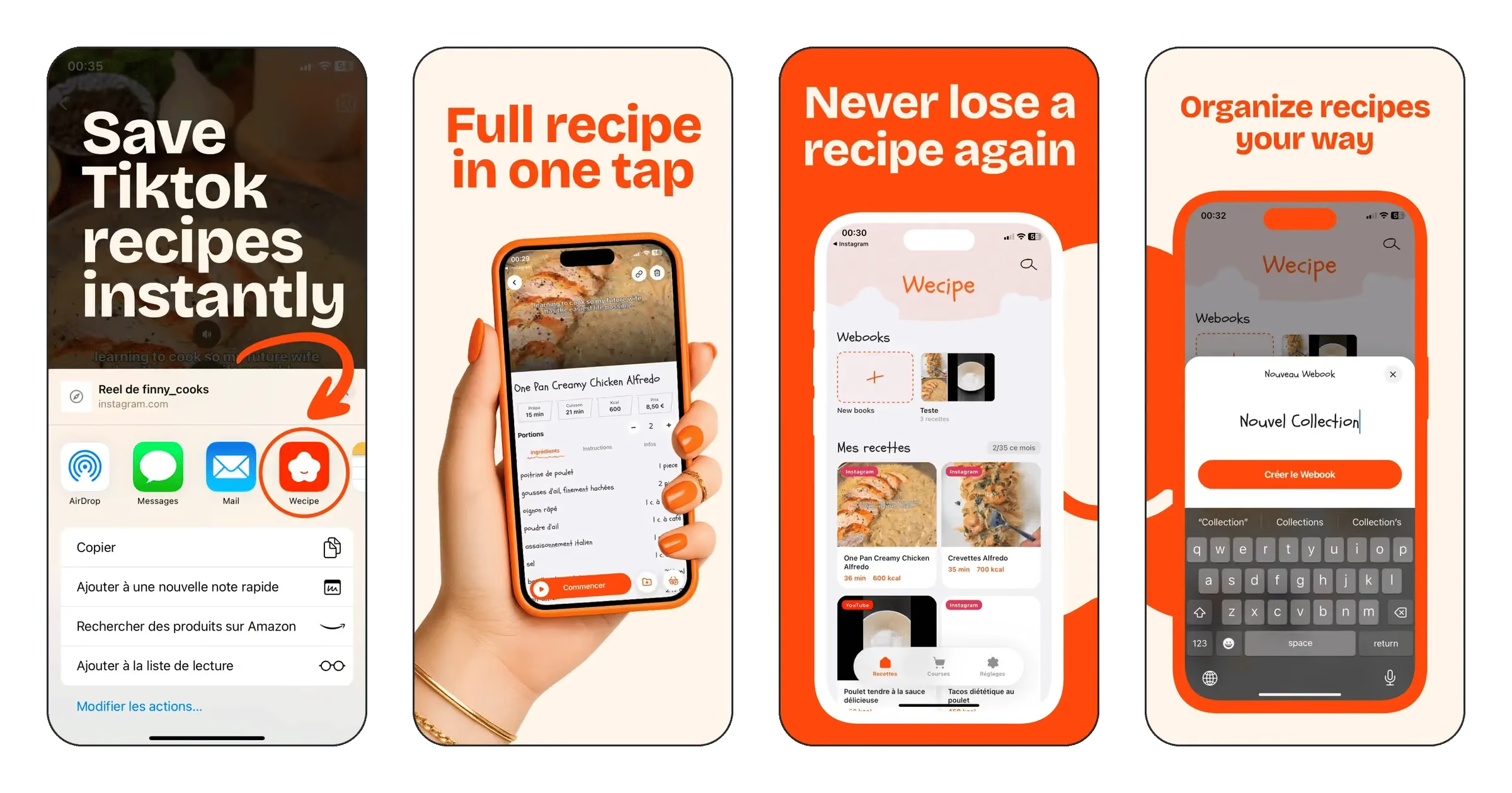
Write a sentence that names the user’s task and the outcome your app supports. For a hypothetical recipe organizer, “Keep your saved recipes together” gives the design a concrete direction. “The ultimate kitchen experience” leaves the reader to work out what the app actually does. The useful sentence also tells you which screen to capture: a saved recipe collection is stronger evidence than a settings panel.
Draft three versions in plain text. One can emphasize the task, another the outcome, and a third the distinctive workflow. Read each without the app name. If it could describe almost any app in the category, make it more specific. Shorten the wording by removing claims you cannot demonstrate in the screenshot.
Choose a clear reading order
Give the slide one visual entry point. A large headline and a carefully cropped interface can be enough. Decide whether the eye should see the promise first or the product first, then make the size, spacing, and contrast support that decision. Adding a second equally loud element usually creates another decision for the reader.
Keep supporting text subordinate. If the subtitle repeats the headline, remove it. If the device frame consumes space that the product needs, reduce it or use a direct screenshot treatment. A decorative shape earns its place when it helps organize the slide, not simply because the template includes it.
Study references by asking specific questions
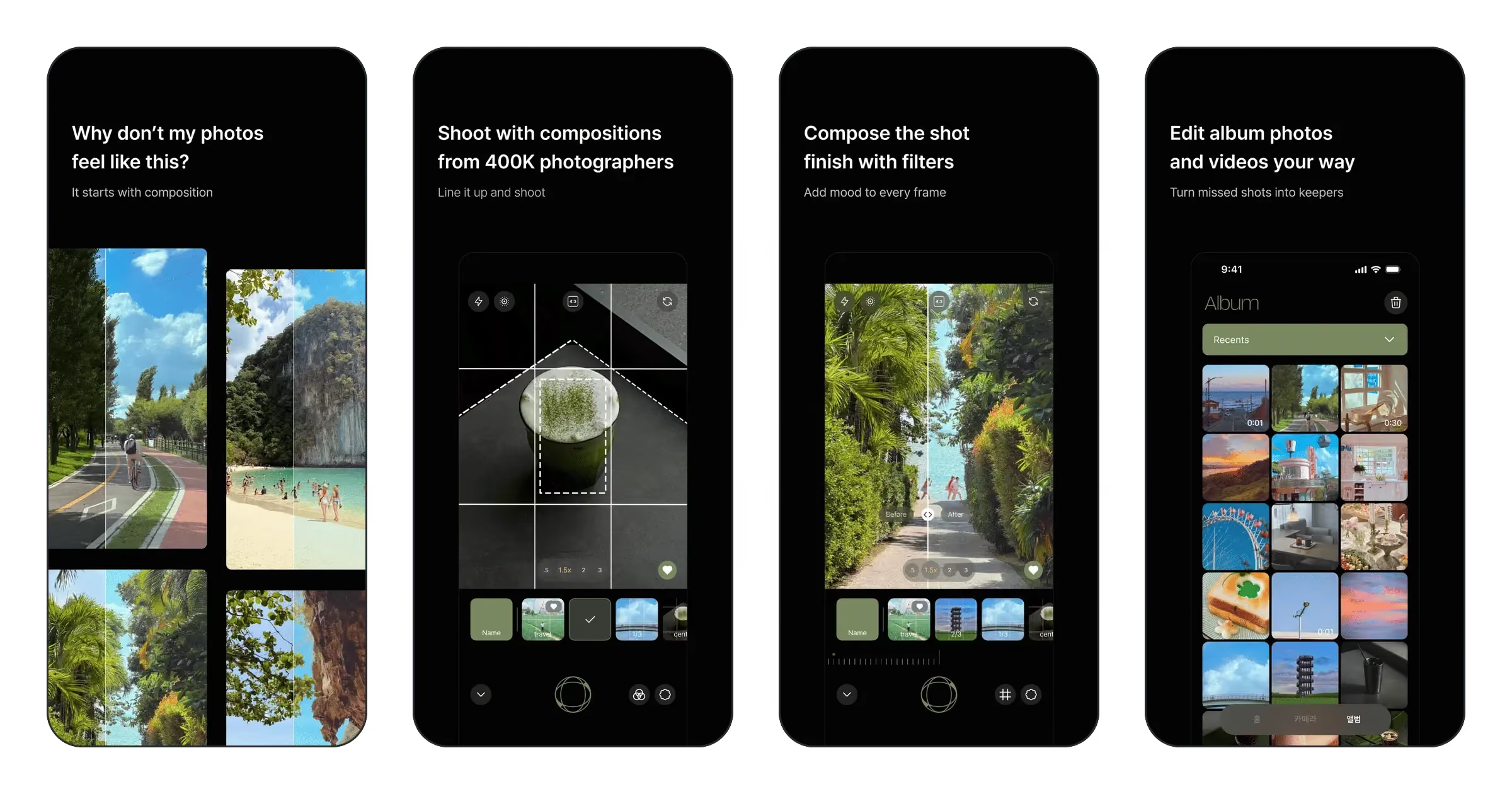
Open YoungPhoto and Headspace in the gallery. The catalog tags identify YoungPhoto with a minimalist style and black, white, and gray palette; Headspace adds whimsical styling and orange and yellow. These are different starting points, rather than a universal recipe for a good screenshot.
For each reference, write down the job of the first slide, the largest element, the amount of interface shown, and how the second slide adds information. Then sketch a layout using your own product and copy. Borrowing a hierarchy is a useful exercise; lifting another app’s artwork or making its screenshots stand in for your product is not.
Make the next two slides advance the story
Give each slide a distinct question to answer. A practical opening sequence might be “What is it?”, “How do I use it?”, and “Why would I keep it?” For a hypothetical recipe organizer, that could become a collection overview, an import workflow, and a cooking view. The order should reflect how the actual app works.
Try putting just the three headlines in a row. If they tell the same story three times, change the roles before polishing the artwork. If they depend on a sentence being split across images, rewrite them so each can stand on its own. A visitor may see only part of the sequence.
Run a thumbnail review
Reduce the finished slide until it looks roughly as small as the screenshots you browse on your phone. This is a design check, not an official font-size specification. Ask a colleague to describe the app without reading a brief first. Their uncertainty is more useful than asking whether they like the colors.
- Can they identify the main benefit without zooming?
- Can they tell which part is the product interface?
- Does the interface actually support the headline?
- Is any essential word lost against an image or a gradient?
- Would removing one element make the message clearer?
Turn a design preference into a test
If the app is eligible, Apple’s product page optimization supports testing alternative screenshot treatments and reviewing their performance. Start with a specific question, such as whether a workflow-led opening communicates the app better than a collection overview. Changing every element at once makes the result harder to interpret.
There is no promised conversion gain from a particular color or layout. Use references to produce a reasoned design, then use feedback and the data available for your app to decide what deserves another iteration. Before exporting the final set, check the dimensions and file checklist.
Sources & further reading
Technical references checked November 5, 2026.