
The No-BS Guide to App Store Screenshots (2025)
You’ve spent months building a killer app. Now you’re staring at that blank screenshot panel inside App Store Connect. Don’t blow it. Your screenshots are your storefront—and your first shot at conversion.
1. First Screenshot = First Impression
Think of this as your billboard. Don’t lead with a generic UI screen.
✅ Do this:
Text: “Track your habits in under 10 seconds a day”
Visual cue: Zoomed-in feature, clean layout, bold text
🚫 Avoid:
“Welcome to [App Name]” with a full-screen settings UI
2. Use Real, Human Copy
Avoid jargon. Be direct and useful.
✅ Do this:
“Plan your meals without stress”
“Find your focus in minutes”
🚫 Avoid:
“Optimize cognitive workflows through enhanced modularity”
3. Make it Pop with Contrast
Design to interrupt the scroll.
✅ Do this:
Bright colors like teal, coral, or neon gradients
High-contrast white text on solid backgrounds
🚫 Avoid:
Generic white or black backgrounds unless highly stylized
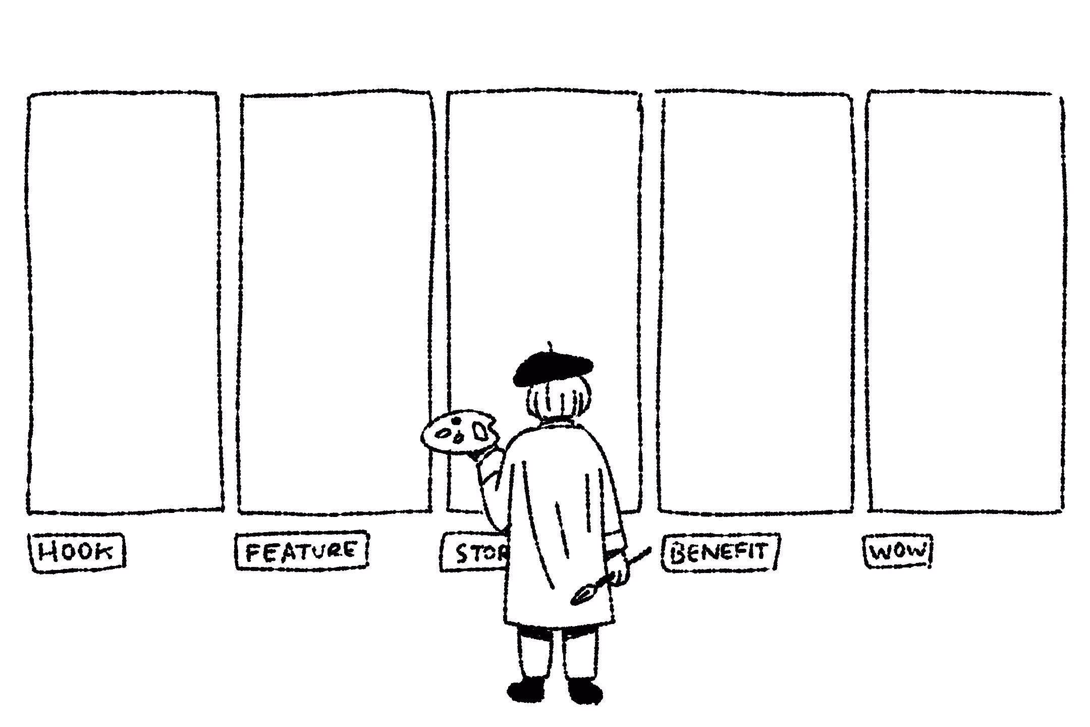
4. Build a Visual Story
Arrange your screenshots like a sequence, not random drops.
✅ Sequence structure:
- What the app does
- Why it’s useful
- How it works
- What makes it better
- Bonus feature or emotional appeal
5. Don’t Rely on UI Alone
Add overlays, minimal captions, or callouts to focus the message.
✅ Do this:
“Export in 1 tap” (caption with arrow pointing to button)
“Daily progress, visualized” over a graph screen
🚫 Avoid:
Raw UI screenshots with no context or explanation
6. Add a Twist—Carefully
Sometimes a subtle oddity makes you pause and read.
✅ Ideas:
- Retro-themed UI styling for a modern app
- Playful metaphor like “Your brain’s daily planner”
- Surprising layout flip (diagonal crop, stacked icons)
7. Design for Real Devices
Always test on mobile before publishing.
Checklist:
- Font size readable at iPhone SE size
- Text under 7 words per screen
- Design at 1242x2688 px (iPhone XS Max)
- Avoid screen clutter
8. Localize to Win Global Markets
Go beyond translation—localize visuals.
✅ Do this:
- Change emojis, flags, or currencies
- Use phrases like “Get organized” vs. “Stay on track” depending on region
- Mirror layouts for RTL languages
9. Use Tools That Save Time
Don’t design everything from scratch.
Suggested tools:
- Previewed
- DaVinci Apps
- ShotBot
- Figma with screenshot templates
10. Always Be Testing
You’re probably wrong about what works. Test to find out.
Test these elements:
- First screen headline: “Build habits fast” vs. “Your daily ritual”
- Background: blue gradient vs. warm coral
- UI-only vs. UI + emoji icons
